TRANQUILITY
CONTEXT
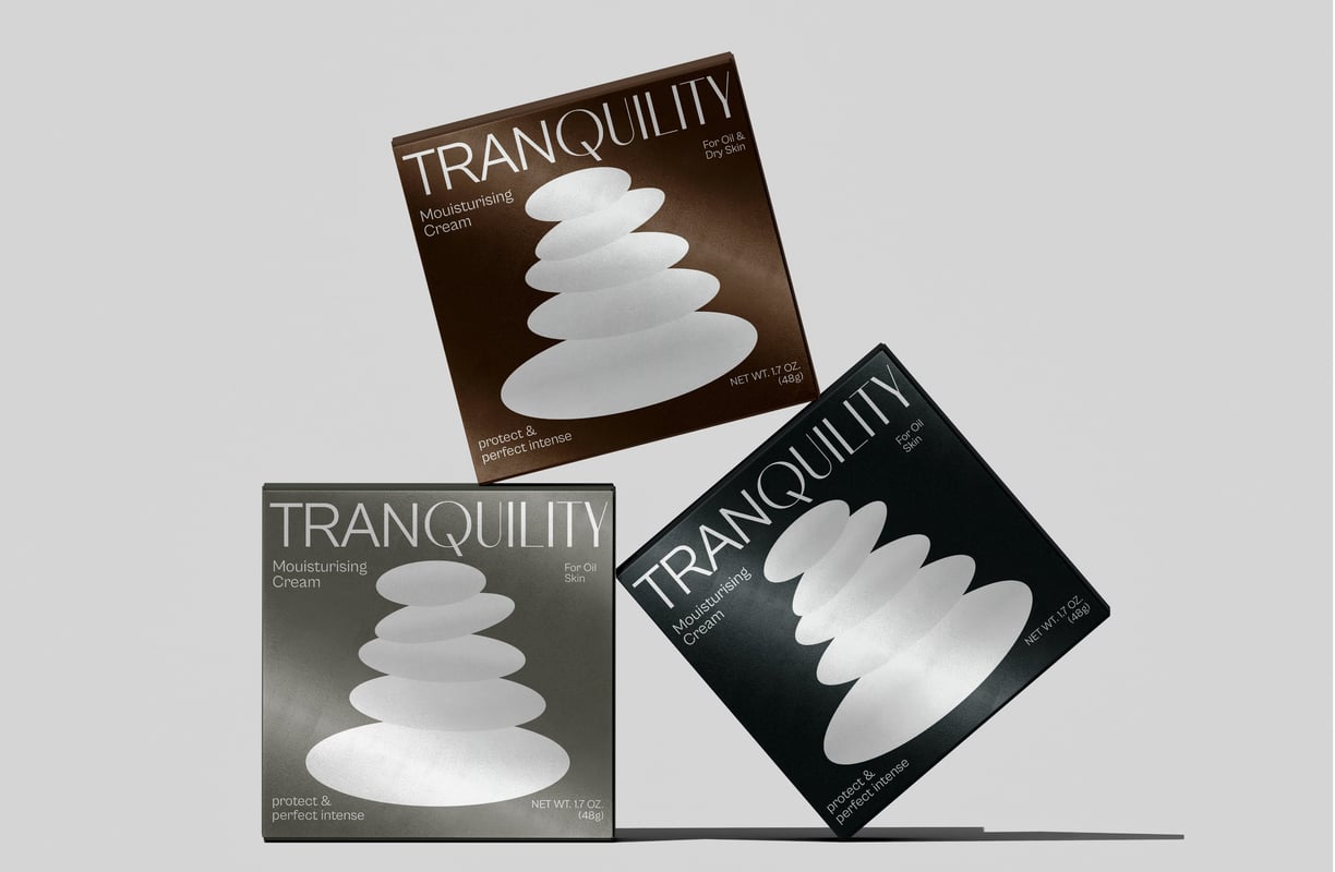
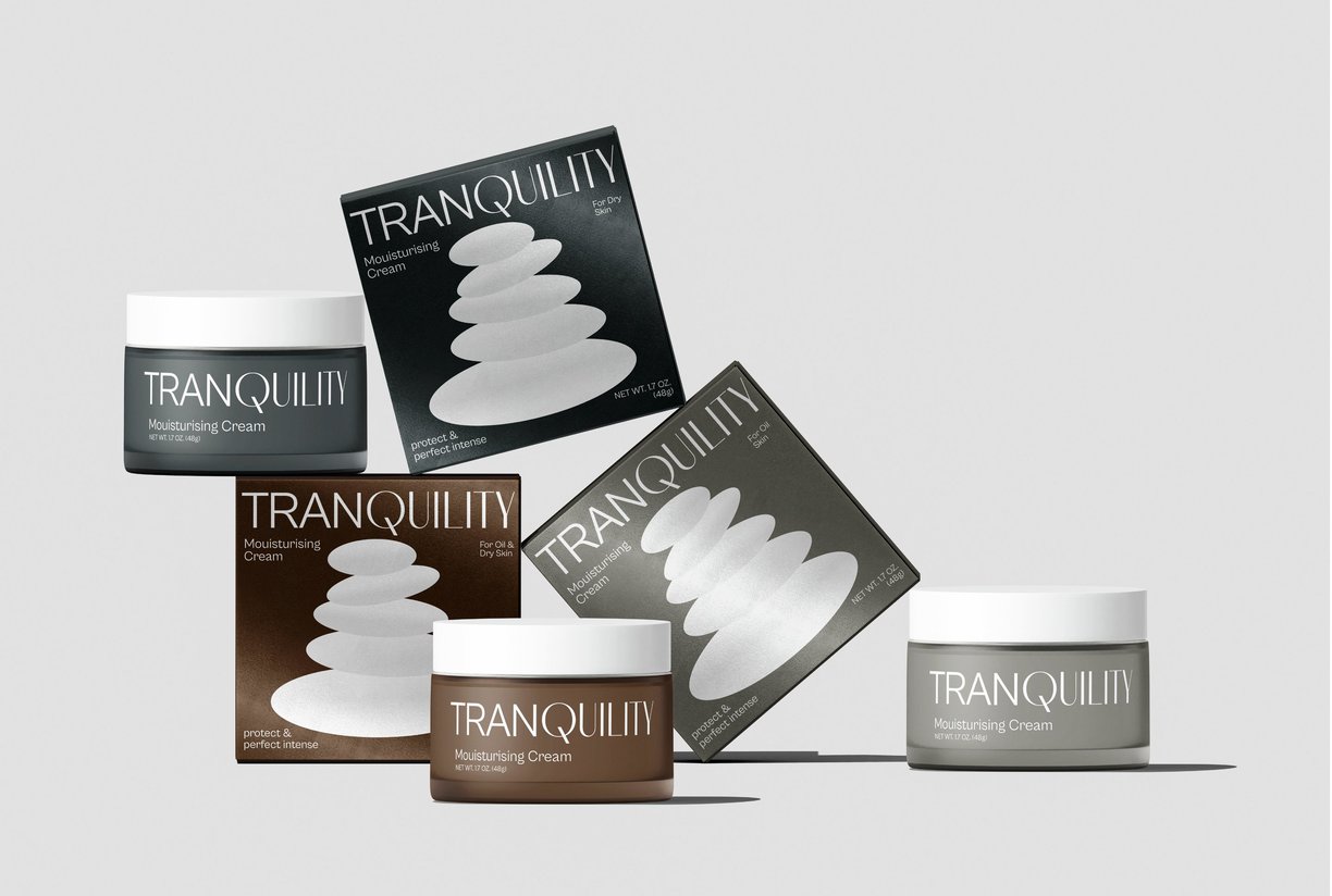
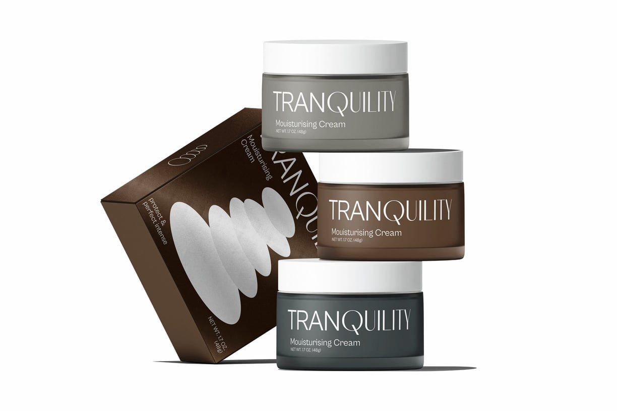
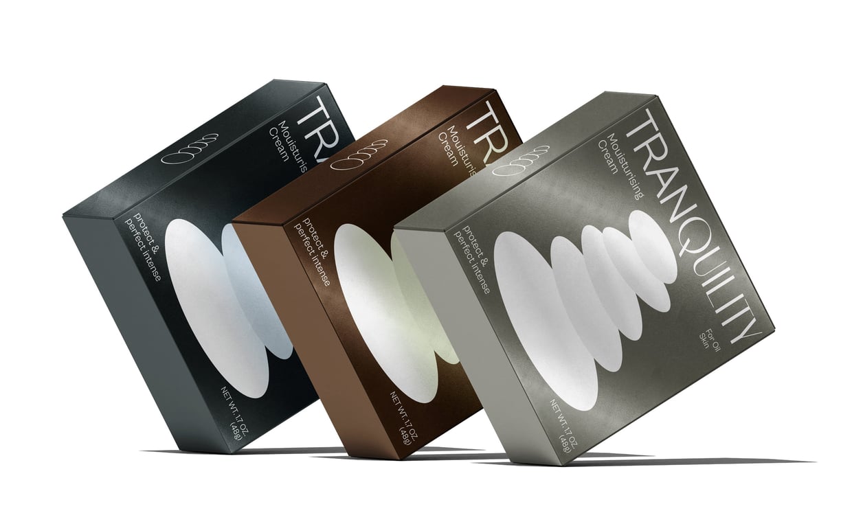
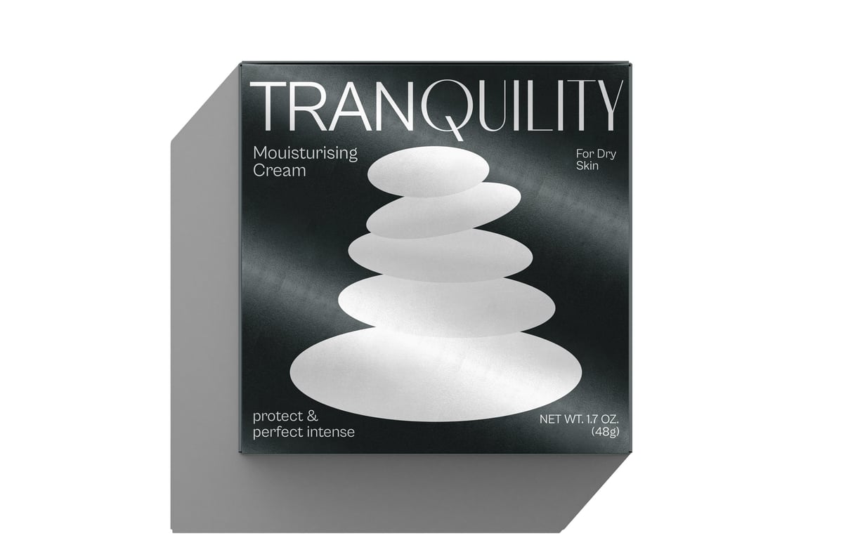
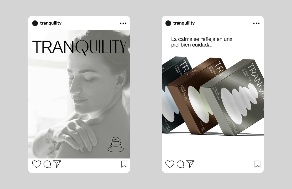
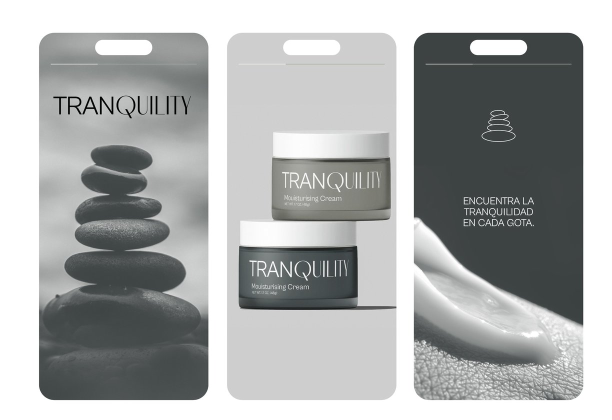
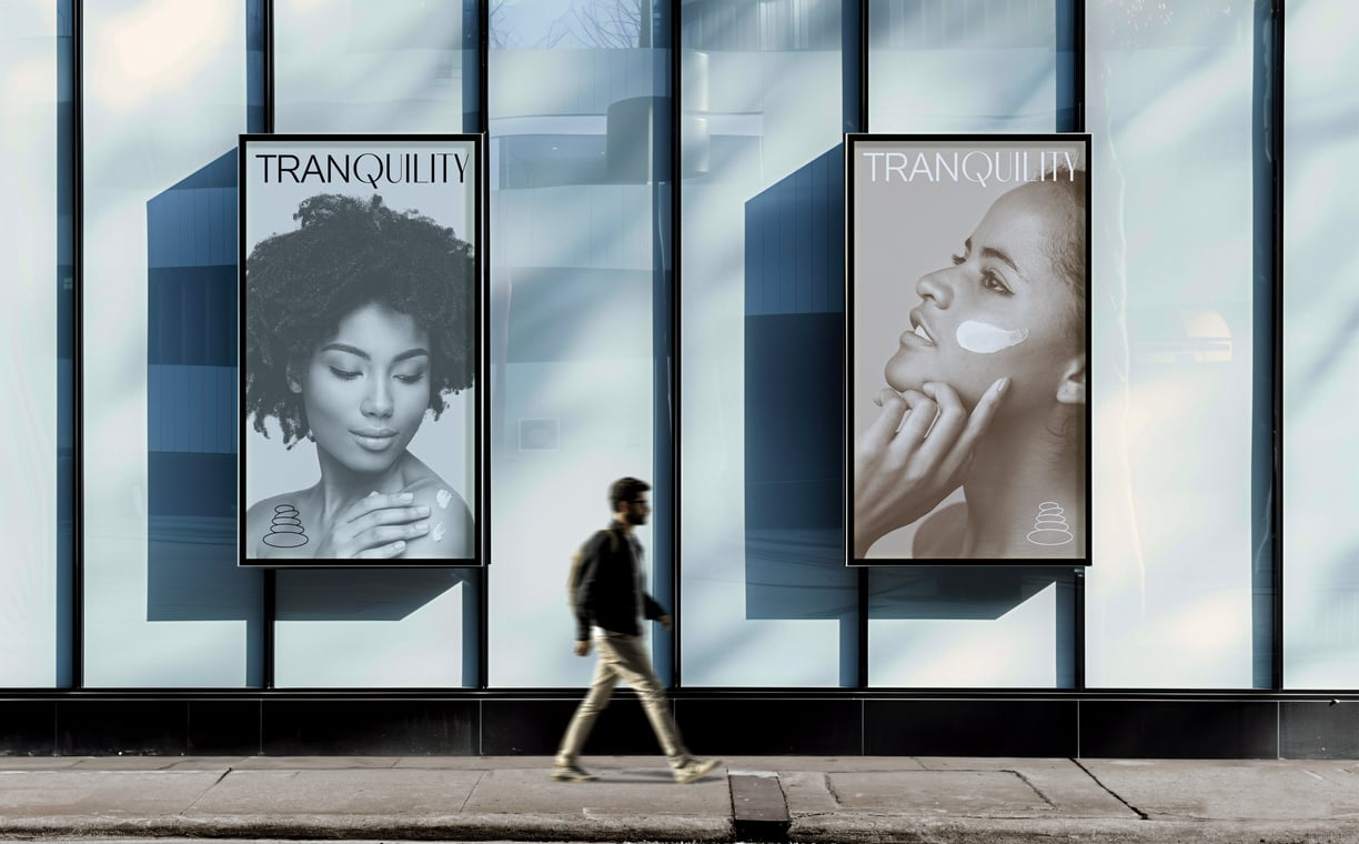
Tranquility was developed as a brand of moisturizing creams inspired by the serene and balanced essence of Zen stones. The goal was to create products that not only nourish the skin but also convey a sense of peace and harmony, offering consumers a calming experience through every interaction with the brand.
CHALLENGE
The main challenge was to build a brand identity that genuinely reflected the tranquility and balance at the heart of the product concept. The design needed to evoke a sense of calm while standing out in a crowded market. Tranquility also sought to align its visual and functional elements with the values of sustainability and mindfulness, appealing to a target audience that prioritizes wellness and eco-conscious choices.
SOLUTION
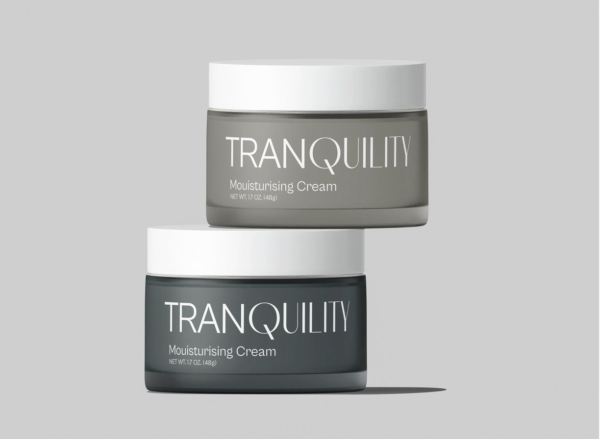
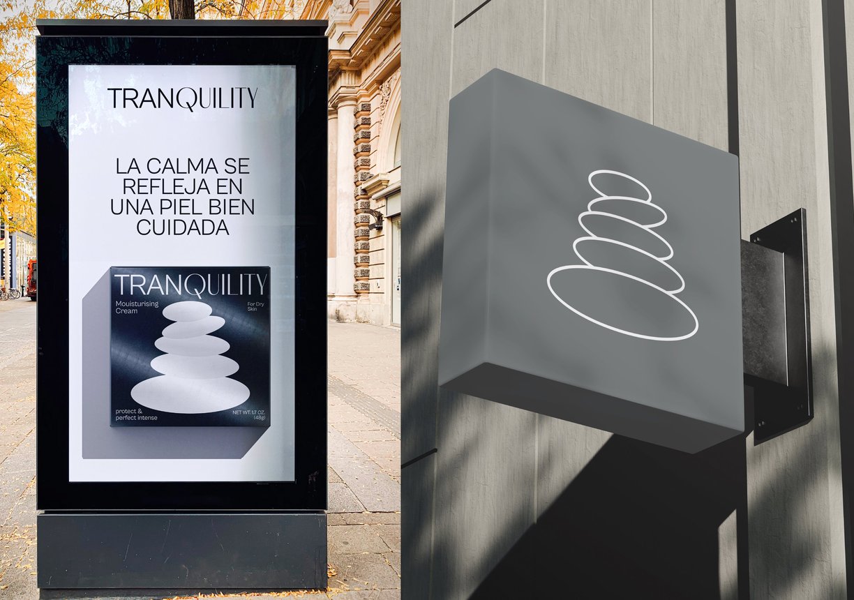
The solution began with creating a simple yet meaningful logo that incorporated Zen stone imagery, symbolizing balance and serenity. The brand name, “Tranquility,” was carefully stylized to reflect the essence of peace and harmony, becoming a central part of the visual identity.
INDUSTRY: COSMETICS / PERSONAL CARE
SERVICE: BRANDING / PACKAGING
NEXT PROJECT
We are a design studio specializing in brand identity and packaging design. Our mission is to craft transformative projects fueled by the strength of human connections.
Contacts
+356 99192218
dabro.studiodesign@gmail.com
WORKING
WORLDWIDE
