
FRESHCO
CONTEXT
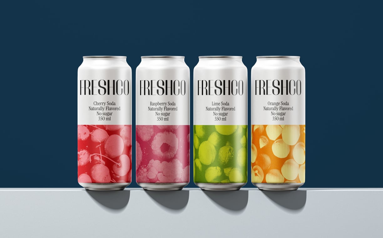
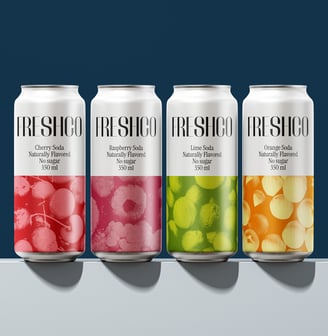
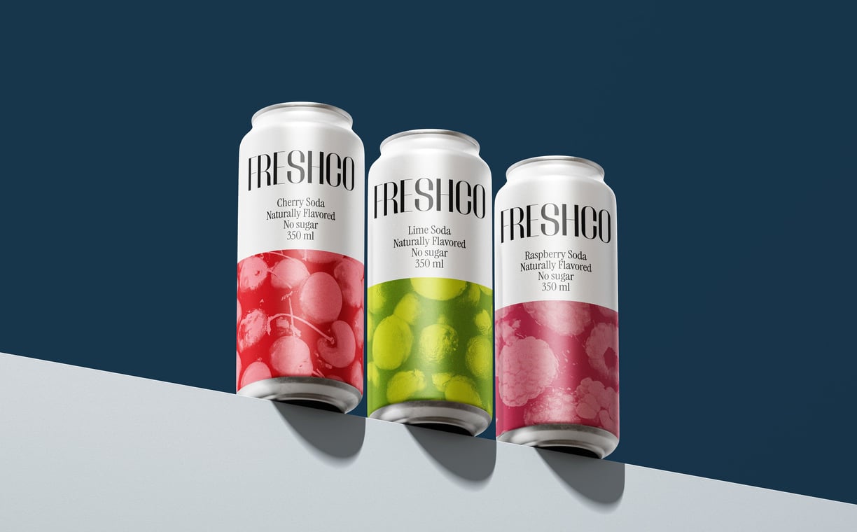
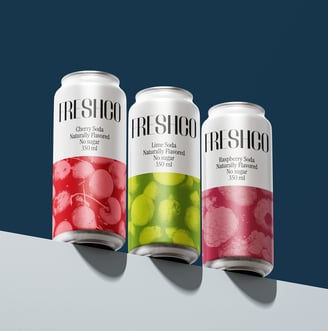
Freshco was born from a desire to redefine the soda market with a focus on natural flavors and simplicity. As consumers increasingly sought healthier and more authentic beverage options, Freshco aimed to deliver a product that felt refreshing in every sense—pure, vibrant, and natural. With four distinctive flavors—strawberry, orange, lemon, and cherry—Freshco wanted to highlight the natural goodness of its ingredients while standing out on the shelf with a clean and modern aesthetic.
CHALLENGE
The primary challenge was to design a visual identity and packaging that communicated Freshco’s commitment to natural ingredients while differentiating it from the overly colorful and artificial branding commonly associated with sodas. The design had to appeal to a modern audience, convey freshness, and ensure each flavor was easily recognizable, all while maintaining a cohesive brand identity.
SOLUTION
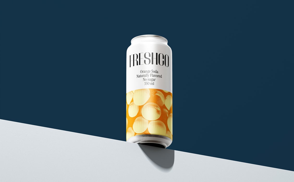
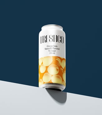
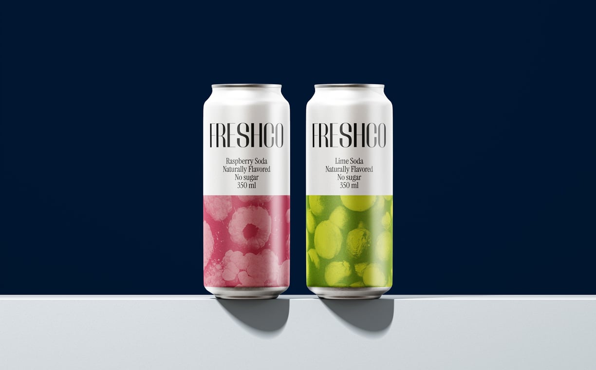
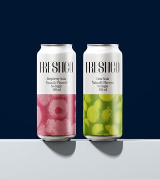
The Freshco cans were designed with a minimalistic approach to emphasize the brand's natural essence. Each flavor was represented by a clean layout featuring the fruit as a central focus, captured in a duotone effect that added a modern and artistic twist. This technique highlighted the vibrancy of the flavors while ensuring a distinctive look for each product.
INDUSTRY: BEVERAGE
SERVICE: BRANDING/PACKAGING
NEXT PROJECT
Somos un estudio de diseño especializado en identidad de marca y diseño de packaging. Nuestra misión es crear proyectos transformadores impulsados por la fuerza de las conexiones humanas.
Contacts
+356 99192218
info@dabro-studio.com
Subscribe to our newsletter
WORKING
WORLDWIDE