
AROMATO
CONTEXT
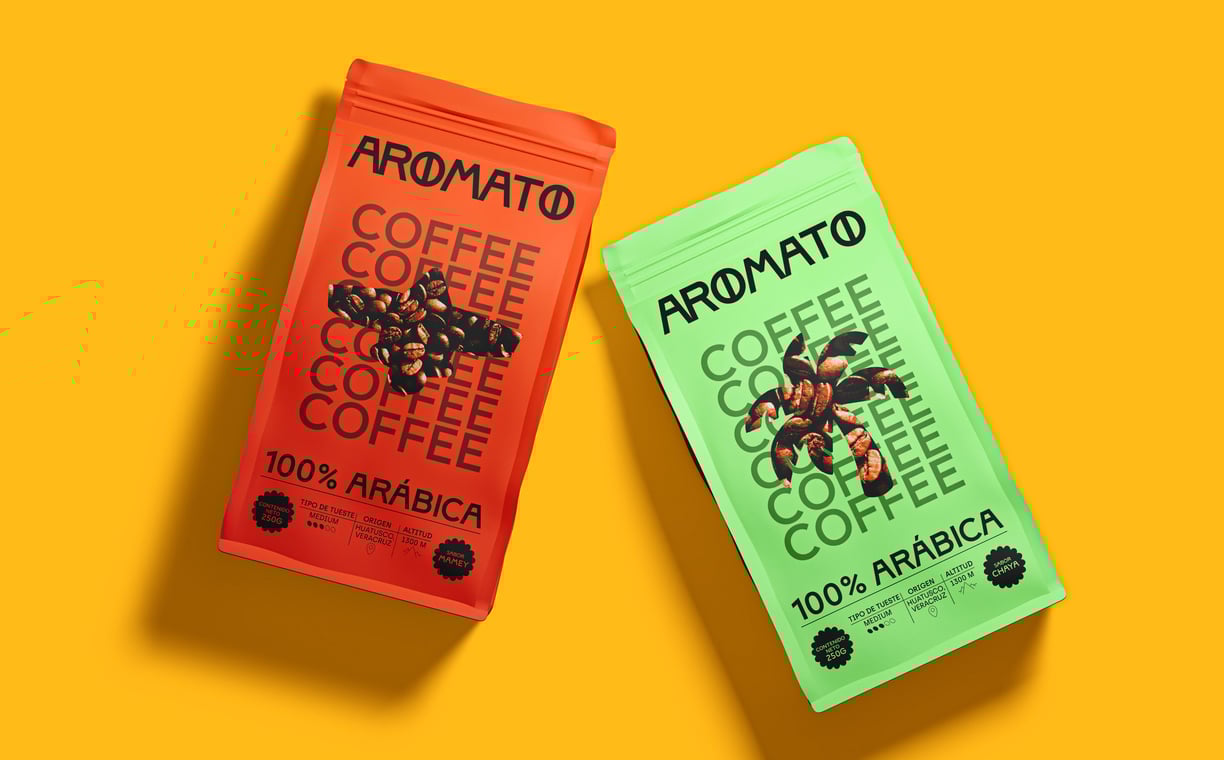
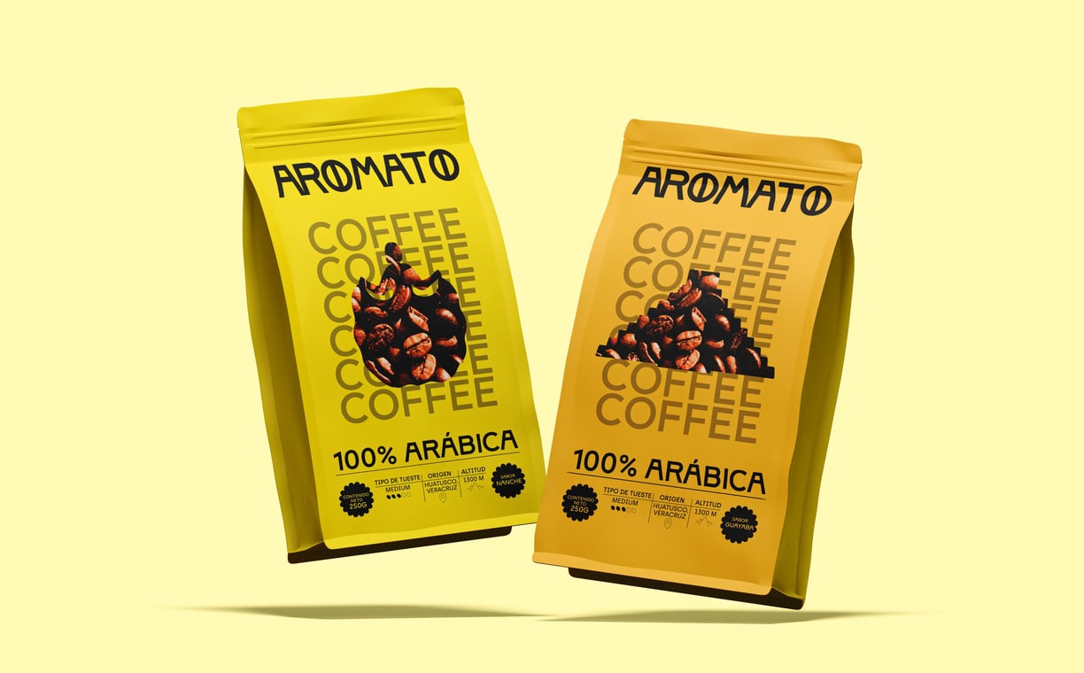
Aromato was born from the need to unite as a diverse team to share a common vision: promoting the national consumption of coffee in Cancún. Inspired by the richness of Quintana Roo, they created a unique concept that blends the tradition of coffee with distinctive local flavors such as mamey, dragon fruit, orange, chaya, and nance. The goal was to reinvent the coffee experience, connecting people to the region’s flavors while highlighting Mexico's cultural and natural richness.
CHALLENGE
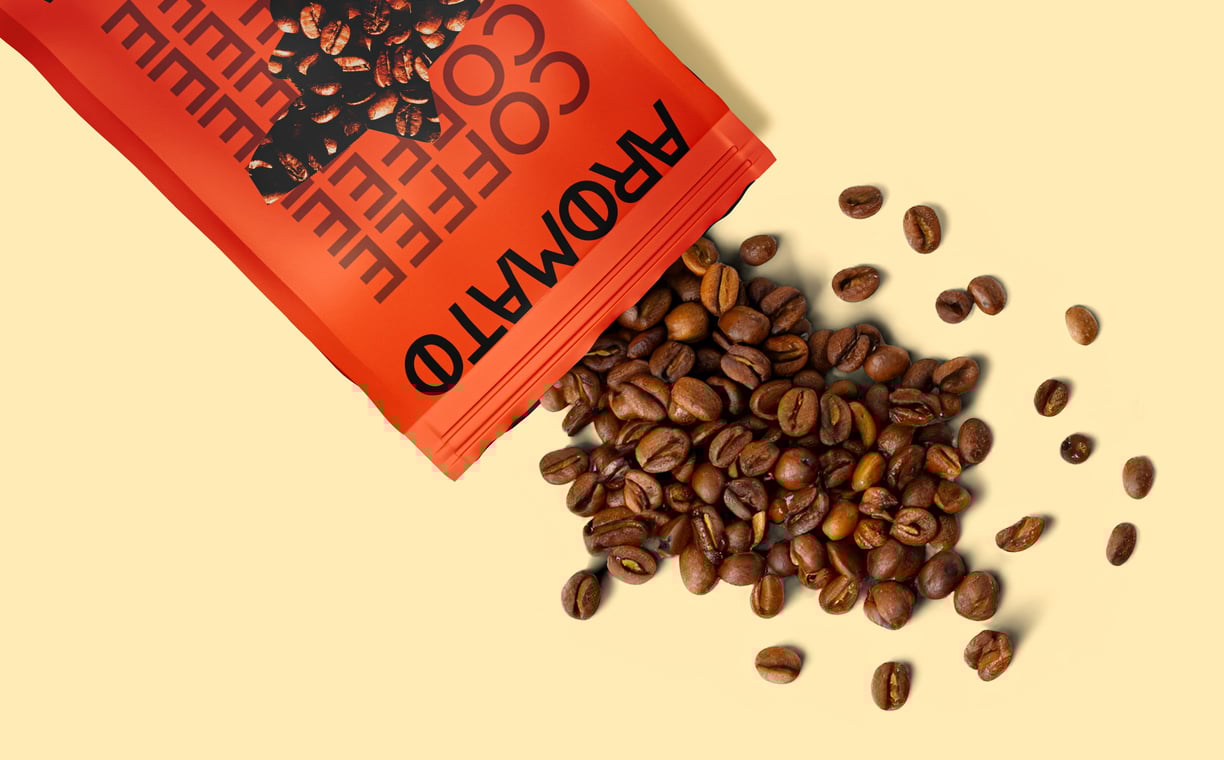
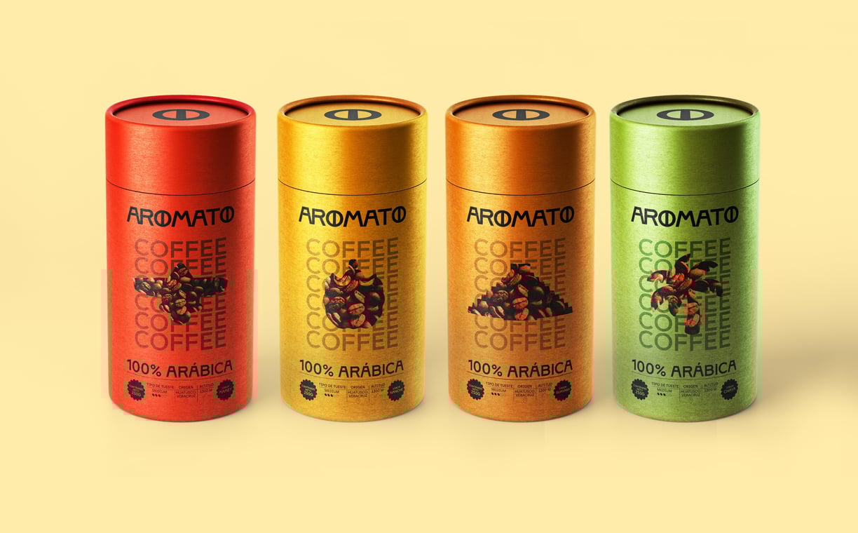
The brand’s vision to celebrate the richness of Quintana Roo and its unique flavors demanded labels that were not only visually striking but also culturally meaningful. Each package needed to capture Aromato’s essence: a blend of coffee tradition with local ingredients like mamey, dragon fruit, orange, chaya, and nance.
SOLUTION
The final design solution involved creating packaging that represented the vibrant colors of each fruit and ingredient, seamlessly blending them with graphic elements inspired by Mexican culture. Patterns and symbols evoking the region’s artisanal heritage were combined with design elements reflecting coffee's essence—warmth, richness, and tradition.
INDUSTRY: FOOD/BEVERAGE
SERVICE: BRANDING/PACKAGING
NEXT PROJECT
Somos un estudio de diseño especializado en identidad de marca y diseño de packaging. Nuestra misión es crear proyectos transformadores impulsados por la fuerza de las conexiones humanas.
Contacts
+356 99192218
info@dabro-studio.com
Subscribe to our newsletter
WORKING
WORLDWIDE